Tuesday, 16 December 2014

Task 5: Designers Technical Commentary

Compression and File Extensions -

File formats are sequences of data used to encode digital information for storage or exchange.
Digital media files can be large so it is useful to compress them for easy storage or delivery. Despite saving space, compressed files can delay the opening of the file and some types of compression can affect the quality of the file.
The most used compression types that I used in this unit were png, jpg and pdf.
JPG: The JPEG compression is typically used on photographs or paintings of realistic scenes. JPEG is also the most common format saved by digital cameras.


PNG: PNG was designed for transferring images on the internet and does not support non-RGB colour spaces.


PDF:  Meaning 'Portable Document Format' PDF is a format used to present documents in a way that does not involve application software, hardware and operating systems. Each PDF file contains a fixed-layout flat document including the font, text and graphics.


Vector Images -

Vector Images are most commonly created and displayed within drawing programs. Common vector images include architectual drawings, flow charts, logos and fonts. Unlike raster images, vectors can be reshaped or rescaled without losing quality. Vector graphics consist of shapes called 'objects' which can be edited seperately for example changing the colour, shape, size etc.  The vile size for a vector is also often very small.


Bitmap Images -

A Bitmap image is created whenever you take a photograph using a digital camera or scan an image from a magazine. A bitmap graphic is made up of tiny pixels which are often lots of different colours. The computer has to store every single pixel in the image which means that the file size is often quite large. When you resize or rescale a bitmap image it usually loses quality.

original image.

resized image.

Workflow: Photoshop -

The typical Digital Photo Workflow goes as follows: take the digital picture, download onto computer, edit the picture, archive the picture.


Monday, 15 December 2014

Final Magazine

Task 3: Creation of Final Magazine

Brainstorm Ideas;

  • Magazine about YA Literature incl. reviews etc.
  • Fashion Magazine
  • Music Magazine
  • Magazine about Fantasy Lit: Game of Thrones, Brandon Sanderson, etc.
  • Magazine about books in general - Books to Movie, Game of Thrones, Reviews.
Two Ideas for Mood Board;
  • Magazine about YA Lit
  • Fashion Magazine
Mood Boards;


Name and Masthead designs;

After deliberating on a few different fonts for my magazine I settled on using a bold font for the front cover title because I feel that it'll suit the magazine and what it is about. The headlines for the articles will also be in a bold font but it'll be different from the title of the magazine because I think they show different things.


Fonts and Colour Pallettes;

The font on the front cover will be 'Edition' because I think that it really suits the magazines front cover and makes it seem like a professional magazine because it's not a 'fun' font. The font for the headlines will be 'Bebas' because it is bold and draws attention to the headline so that people automatically know what the article will be about. It is also not a distracting font so the readers attention won't be drawn from the actual text. I used 'Trajan Pro' for the articles because it is easy to read and looks neat without being too 'in your face' with looped letters and it's not a standard font.


The colour scheme that I used for Young Readers is light blue, black and white because I think that blue is a neutral colour for both teen boys and girls without it being 'girly' so that boys won't want to read it. I originally thought of using a grey colour scheme with a bold accent colour like red but decided not to go with that colour scheme because that might be more suited towards the older audience instead of the young adult audience that my magazine is aimed at.

Imagery;

Most of the images used will be my own photography to avoid copyright and also so that the images in the magazine will be creative and reflect my own ideas of what the magazine is about. The pictures were taken in natural lighting with an iPhone because I want the magazine to be aimed at younger people so I didn't want the quality to be that of a really expensive camera.


Final Magazine


Monday, 1 December 2014

A flash banner is means of advertising that uses flash to incorporate animation, transitions, sound and interactivity to attract customers and hold their attention to better inform and interact with them.


(click image to view example)


Sunday, 9 November 2014

Task 1d: Research into Adobe Digital Publishing Suite


Some capabilities of the Digital Publishing Suite (DPS) is that it adds interactivity to whatever you publish by being able to add videos, audio and slide shows. You are also able to customise what you make with your particular branding. Using the DPS you can also publish anywhere and reach your target audience wherever they are.

Adobe InDesign is the central componant of the workflow DPS. Using InDesign you can create layouts and add interactivity. Once you've created a layout you can then publish them into a folio format. 


There are many different steps to designing and publishing a digital magazine. Here are some of the steps:

Step 1: You need to install the DPS tools. 
Step 2: Create InDesign documents as the base layout for the digital document.
Step 3: To add interactive objects you need to use the Folio Overlays panel to create and edit interactive objects.
Step 4: Use the Folio builder to create folio and articles.
Step 5: Preview Articles - select a folio or an article in Folio Builder panel and click preview.


(Overview of the DPS)


Wednesday, 5 November 2014

Task 1c: Produce two case studies.


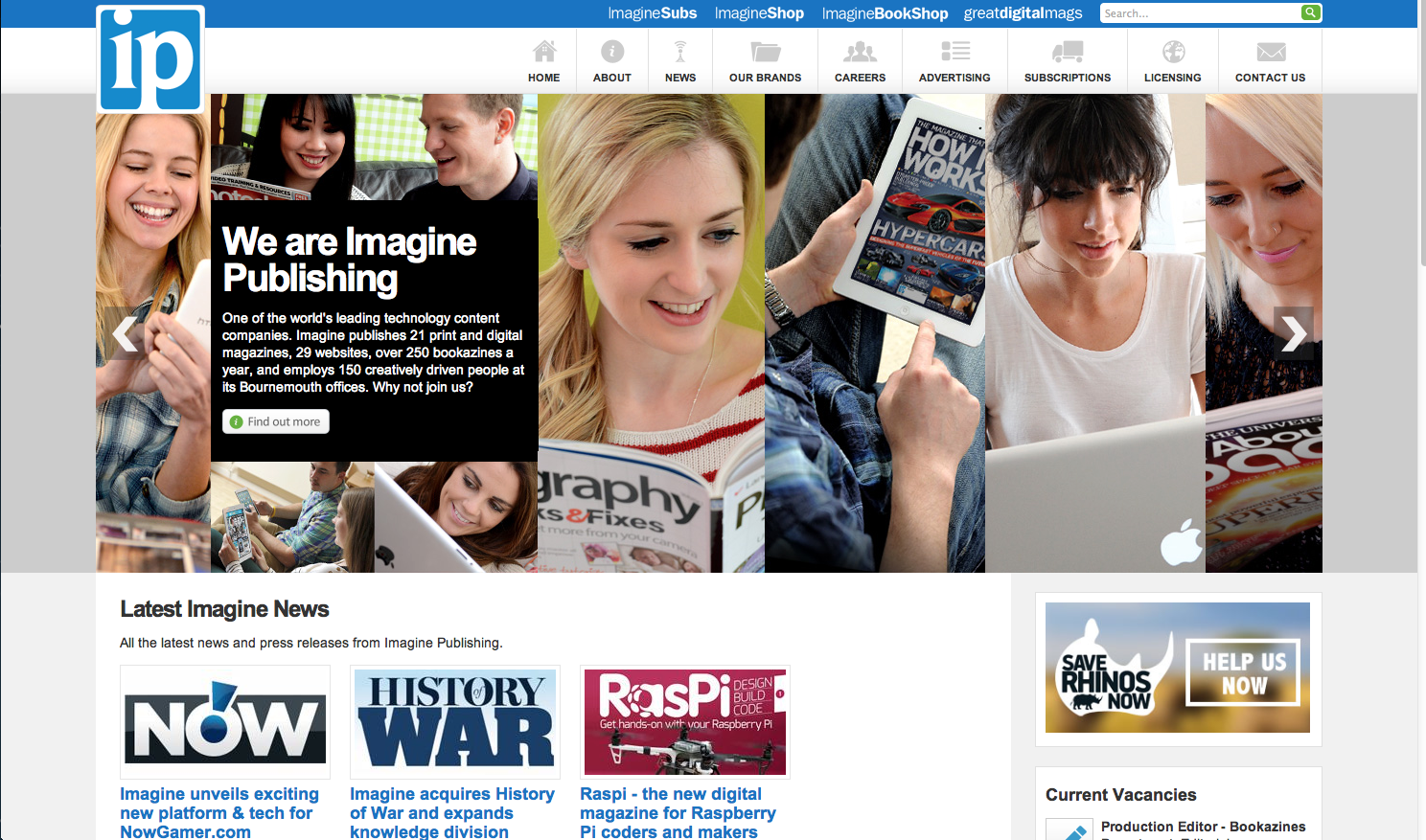
PUBLISHER 1: Imagine Publishing


IP publishes a lot of digital magazines some include: Advanced Photoshop, All About History, All About Space, Brain Dump, Fantasy Artist, History of War, How it Works Illustrated, Photography for Beginners, Photoshop Creative, World of Animals and SciFi Now.


There are also some print magazines that IP publishes such as: Games, How it Works, Photoshop 1-2-3, Total 911, Uncanny Comics, Web Designer and X360 as well as the same digital magazines but in print.


Imagine Publishing also has other creative work for example; they have websites like Digital Artist Daily, Animal Answers and Imagine Book Shop. They also have many eBooks published using Waterstones as a platform - Some of these include: The SciFi Literature Genius Guide and The Complete Photography Book.


Imagine's approach to publishing is that they want to focus on Technology in an age that has a huge dependance on the internet etc. They aim their products at 24-35 year old males who have an interest in Photography, Gaming and Photoshop - Their audience expects specialist knowledge on the topic and so they aim to only publish magazines that deliver a high level of "quality and intelligence". Imagine Publishing also aims to be continually innovative and so the team continues to push the boundaries of publishing, editing and format.


Imagine Publishing won a Media Pioneer Award in 2013 for it's 'content is king' strategy that has made the publisher so successful.

A popular magazine 'games' which is published by Imagine won two awards at the Games Media Awards. The Magazine won the 'Best Multiformat Magazine' and then went on to snag the 'Overall Games Magazine' award later on.

The X360 Deputy Editor also won a GMA Award titled the 'Rising Star'. Managing Director of Imagine comments on this saying "I am extremely proud that the games industry has recognised his great work".


I think that Imagine Publishing is a very successful publishing company. The company itself has won an award and many of the magazines that they publish has also won awards. This to me, means that they are very successful and will be able to continue to publish magazines and eBooks as long as they continue being innovative and keep up the strong bond they have with their clients.


PUBLISHER 2: Blue Toad Publishing


Some of the digital magazines that Blue Toad publishes are: Publishing Executive, CS, Variety, State, Gamenformer and Modern Luxury.


I don't think that Blue Toad publishes any print magazines but if they do then they are the same as the digital magazines that the company publishes.

Blue Toad also creates brochures, catalogs and journals. 


Blue Toad's approach to publishing is to put the audience's message at the forefront. They try to be innovative, flexible and sustainable which, they believe, is why they have worked with "many of the top printers and magazine service providers" in the industry.

Blue Toad Publishing has not won any awards as of yet.

To summarise Blue Toad, I'd say that they're not the most successful publishing company and they still have a long way to go to improve. If they stand by their philosophy and keep up the quality that they publish at now then they could probably go on to win some awards and publish some bigger, more popular magazines in the future which would boost their status as a publishing company.

Monday, 3 November 2014

Task 1b - Analyse two digital magazines.

MAGAZINE 1 - Blunt Issue 132

Blunt is an Australian magazine that stays at the cutting edge of the music scene all around the world - aiming it's content at fans of alternative music and the like. 

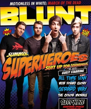
The cover of this magazine uses bold colours and fonts to highlight the important features - 'summer superheroes suit up for sound wave' is in a big font right in the centre of the cover to show that it's something that the readers would all be interested in and to put attention on the main article of this issue. The more famous bands are shown in blue and in a slightly bigger font than the other acts that are shown on the cover because it will attract fans of those artists who might not read the magazine already. The cover also has All Time Low dressed in muted colours against a blue background - this will make them stand out on the cover and also provide a good aesthetic to attract more readers.
As you can see from this image - the font is incredibly small. This is often a problem with using a digital format for magazine (that the font is too small) because it can be difficult for the reader to actually read what the article is saying as the device might not allow zooming.

The layout, however, of this magazine is very appealing to the eye. It has colour to catch the attention of the reader but it's not overwhelming to the point that it's distracting. 

This article in Blunt has a quote in the middle that is meant to intrigue the readers so that they are interested in the interview. These quotes are usually controversial, funny or inspiring. This is not a feature only applicable to Digital Magazines as it occurs in Print Magazines as well.


The layout of this page is very similar to the previous one. It uses primarily monochrome colours but then highlights some important parts with a bright colour. This makes it easier and more pleasant to read instead of some magazines that use either only black and white or they use too many colours that can make it difficult to read on that format (iPhone, iPad, Smartphone).

As a Digital Magazine, Blunt, lacks many interactive features for example: on this page which shows a few latest albums etc they could include links to their iTunes so that it's easier for the reader to access the album immediately instead of having to screenshot or take a note of any that they are interested in buying.


The layout of this page is different than the ones we've seen previously. For example, the background is black instead of white. Other than this, the page is pretty similar again to the ones in the rest of the magazine. As a digital magazine it's probably easier to change up the articles and make them look more aesthetically pleasing. I think this magazine could add a few videos or links just to amp up the interactivity and make it more interesting.


MAGAZINE 2: Spin

Spin is a popular digital magazine that focuses on the music scene. The main feature that sets this magazine apart from many other digital mags is that it has a playlist running at the top of the magazine so that you can listen to the music that the articles are talking about.

This magazine is easy to navigate and the home page has many links to different articles that you can go straight to - instead of having to flick through 10 pages to finally get the article you want.


This online magazine posts music news as it happens - The layout of this page is simple and easy to understand. The headline is in bold which is the first thing that people will read and then if they want to continue reading the article there is a link that will send them to a different page that the article is on.

Spin magazine also has a feature that you can sign up to their newsletter by typing your email address. This is easy for the readers to keep up with the information if they can't access the magazine online.


As you can see from the article above - The font is easy to read which is often a problem for many digital/online magazines as it's difficult to zoom in and out and causes quite an inconvenience. With this format you can also see any related videos to the side of the article which is a good feature to have because it'll interest the target audience more and allow them to keep reading.

This is also another benefit of digital/online magazines because it's easier for readers to find related posts or more posts about celebrities or artists that they are interested in. I particularly like this feature because if it was a print magazine I'd have to search through loads of magazines to find one article about a band that I like whereas with a digital magazine it's all archived onto one place.


This allows the readers of the magazine to talk about the magazine on social media without actually leaving the site which is a good and innovative way of connecting the readers and the writers together.


The main colours of this magazine are red, white and black. This gives it a simplistic look which also makes it easier to incorporate other colours when needed (i.e. album covers) without overpowering the main colours of the website. The minimal colours and lack of bold fonts also give the magazine a much cleaner, crisp look.

This almost-gallery-esque set of links is a huge benefit of digital magazines. It's an extremely easy way for readers to navigate through articles quickly without being bombarded with around 20 all at the same time. It allows for a quick headline/summary of the article and a picture that will attract readers. It's also a lot better looking than shoving a bunch of links on a page (or having multiple articles on a page a la print magazines).


Tuesday, 21 October 2014

Task 1a - Pros and Cons


1)   A detailed list of the pros and cons of digital and print magazines – what are the benefits and limitations of each format? Think about different perspectives for example the reader, the designer and the publisher.

DIGITAL MAGAZINE:

Pros-

  •      Digital Magazines save money because they don’t have to pay for the printing
  •      It is easier to reach the target audience because you can email them directly.
  •      Digital Magazines are more eco-friendly because it doesn’t use any paper or waste any paper if there is a mistake in printing.
  •       Digital Magazines often look a lot better than print magazines because they can include videos and in general have more control over design.


  • Another pro of a digital magazine is interactivity, they can include social media and offer easier ways for the audience to communicate with the publishers.
  • A Digital magazine is an idea that any publishing/magazine company can use – it is ideal for any industry e.g. teen magazines, fashion magazines, business magazines.
  •    Digital Magazines also have full print-style ads so they don’t lose out on any sponsors etc.


Cons-


  •       A huge con of digital magazines is that you can only read them if you have access to wifi which is difficult if you are on your way to work or travelling.
  •       Can be hard to read and requires zooming in and out which can be an annoyance to the reader.


  •       A digital magazine or any type of work posted online is at risk of plaigiarism.
  •       It can cost the publisher more to have the magazine suitable for different users like Android, Apple products and just the traditional desktop browser.
  •      You cannot share a digital copy with someone which could lead to a smaller audience as not everyone has a tablet or smart phone.


PRINT MAGAZINE:

Pros-


  •       A pro of a print magazine is that everyone has access to them and you can read them regardless of internet access.
  •      They can be cheaper to produce that a digital magazine.
  •      Readers can share/lend out a print magazine which could lead to a bigger and wider audience.
  •      You can keep the magazine for as long as you want! On digital devices you often have to delete things in order to update it or to do other things like take pictures which means that you cannot keep the copy forever – whereas you won’t have that issue with print magazines.


Cons-


  •       They have a serious effect on the environment due to the use of paper and ink.
  •      Print magazines are harder for people to archive because they might not have the space in their house for storage.
  •       Print magazines are smaller due to the effect on the environment so it might not be able to fit all the information whereas digital magazines can have as many pages.
  •      It could get expensive to keep buying the magazine every week.
  • Print magazines are harder to move around and carry as opposed to something you would normally keep in your bag.
  •     They can get damaged which lessens their value for money so people might not want to buy something that can get easily destroyed.